Animal Crossing: New Horizons
About this Project
I learned how to apply a UX lens to video games, practice UX methodologies, and appreciate the work that goes into games UI through a series of assignments in Ivy Sang’s UX/UI for Gaming course on ELVTR. I’m very excited to share with you my learning journey with (and case study of) Nintendo’s Animal: Crossing New Horizons (ACNH).
Objectives
Practice UX skills in the context of games
Learn about UI design for video games
Empathize with first-time players for a video game
Discover how experiences are crafted in the video games industry
Have fun doing all the above!
Challenges
Limited timeframe and resources
Limited knowledge of the games development process
Inability to communicate with ACNH’s game designers
No prior experience with creating UI games assets
Duration: 7 weeks
Tools: Figma, Figjam, Google Meets, Fathom
Roles: UX researcher, UX designer, UI designer
Some assets included in this case study, including characters, backgrounds, items and icons belong to Nintendo.


Player Journey
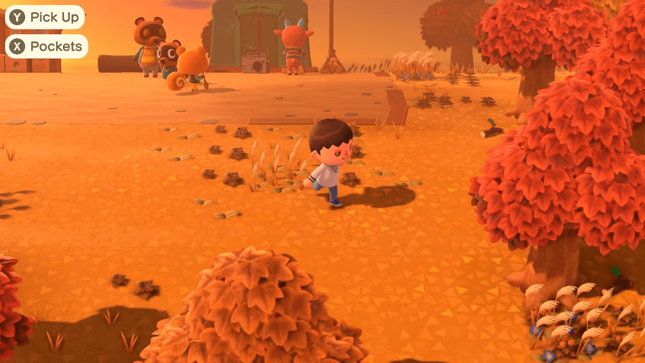
I watched a player’s first time gameplay of the onboarding experience in ACNH. I paid close attention to everything: what the player saw, heard, felt, said, and decided to do. Due to the limitations of watching a video, I worked to empathize and understand the reasons behind the player’s actions. Even though this is just one player, this led me to a few observations and suggestions.


Paper Prototyping & User Flow
After the player journey, I wrote out on post-its the screens where players needed to make choices. I also organized the user’s journey through a flow chart. This really helped me understand the complexity of a first time user experience in ACNH because when on the island, while players technically have a task, they may choose to do otherwise! So, it was very helpful to understand through ACNH’s current design how to potentially deal with those situations.


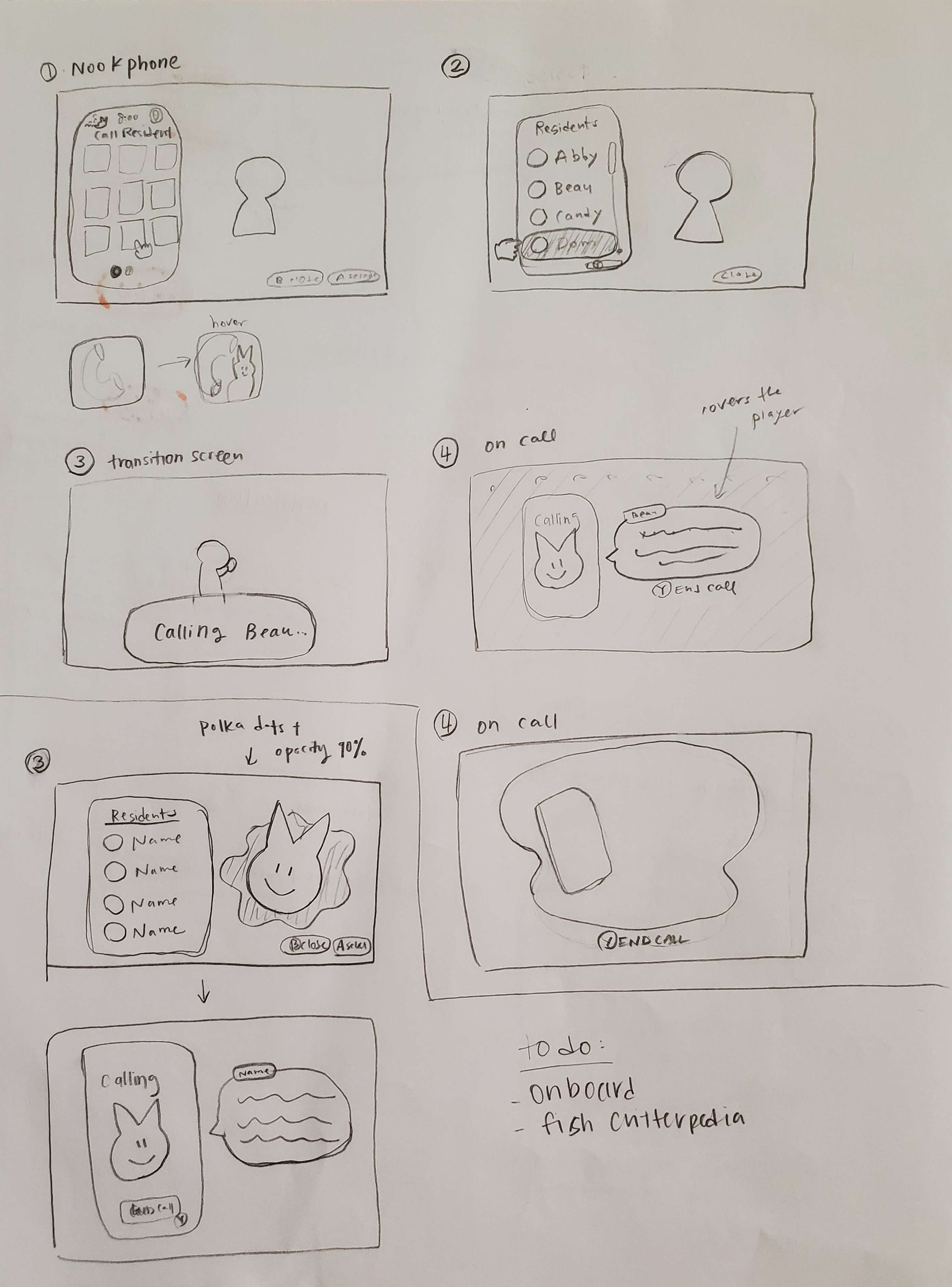
Wireframing
From the onboarding experience, I wanted to wireframe some of the suggestions I made. But also, looking ahead, I knew I was going to run some user tests, so why not take the opportunity to explore some other areas in the game? Due to time constraints, I didn’t really have the opportunity to ask current players - but I did look into the Animal Crossing subreddit. I browsed for common problems people posted about or of features they would have liked to see.
These were the ideas I chose to explore:
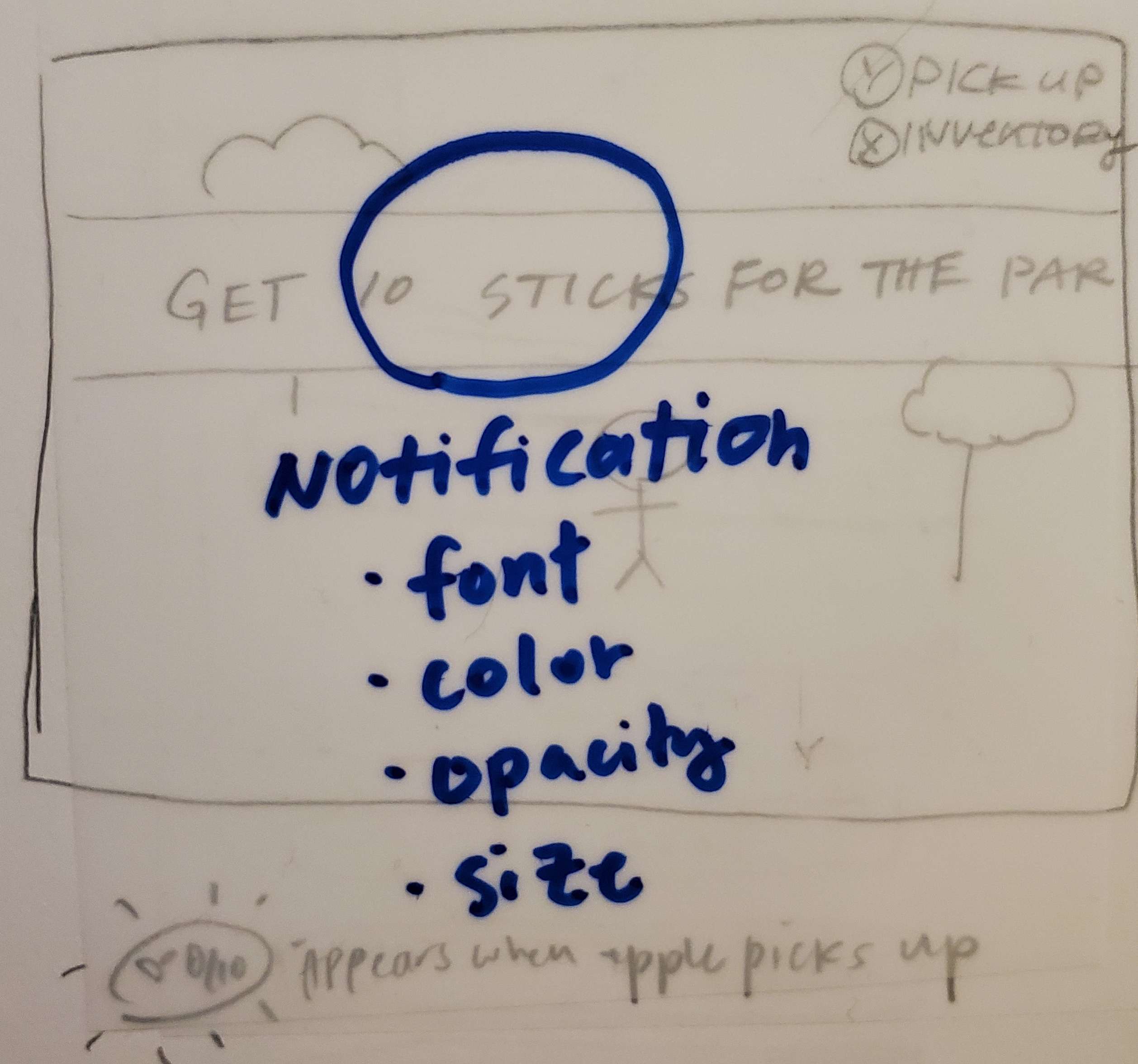
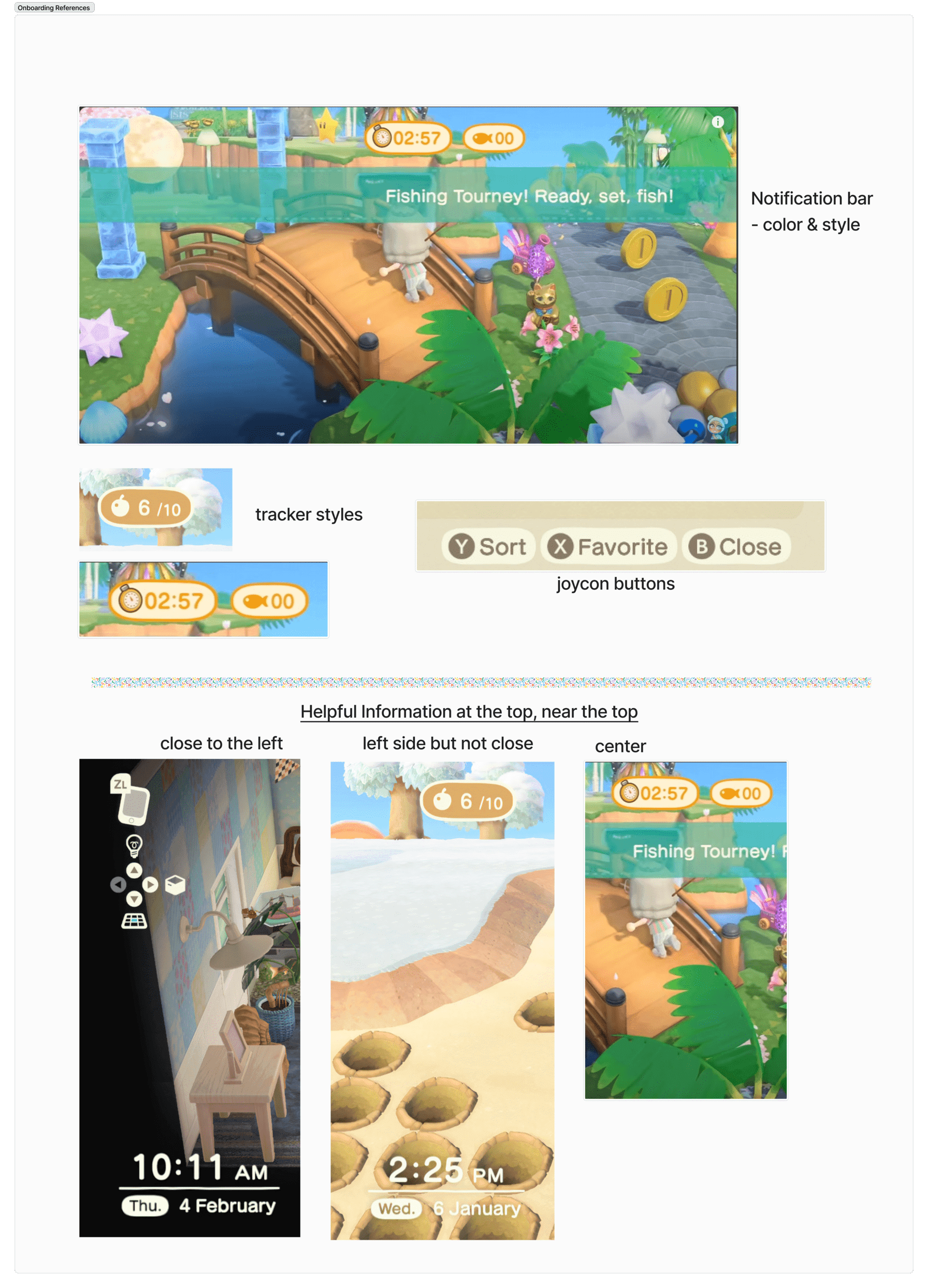
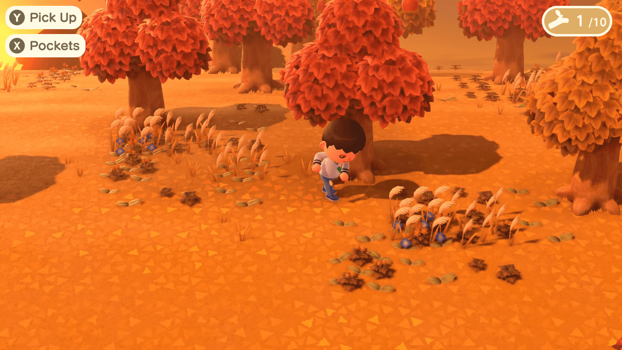
Onboarding: Provide more information during the collection task
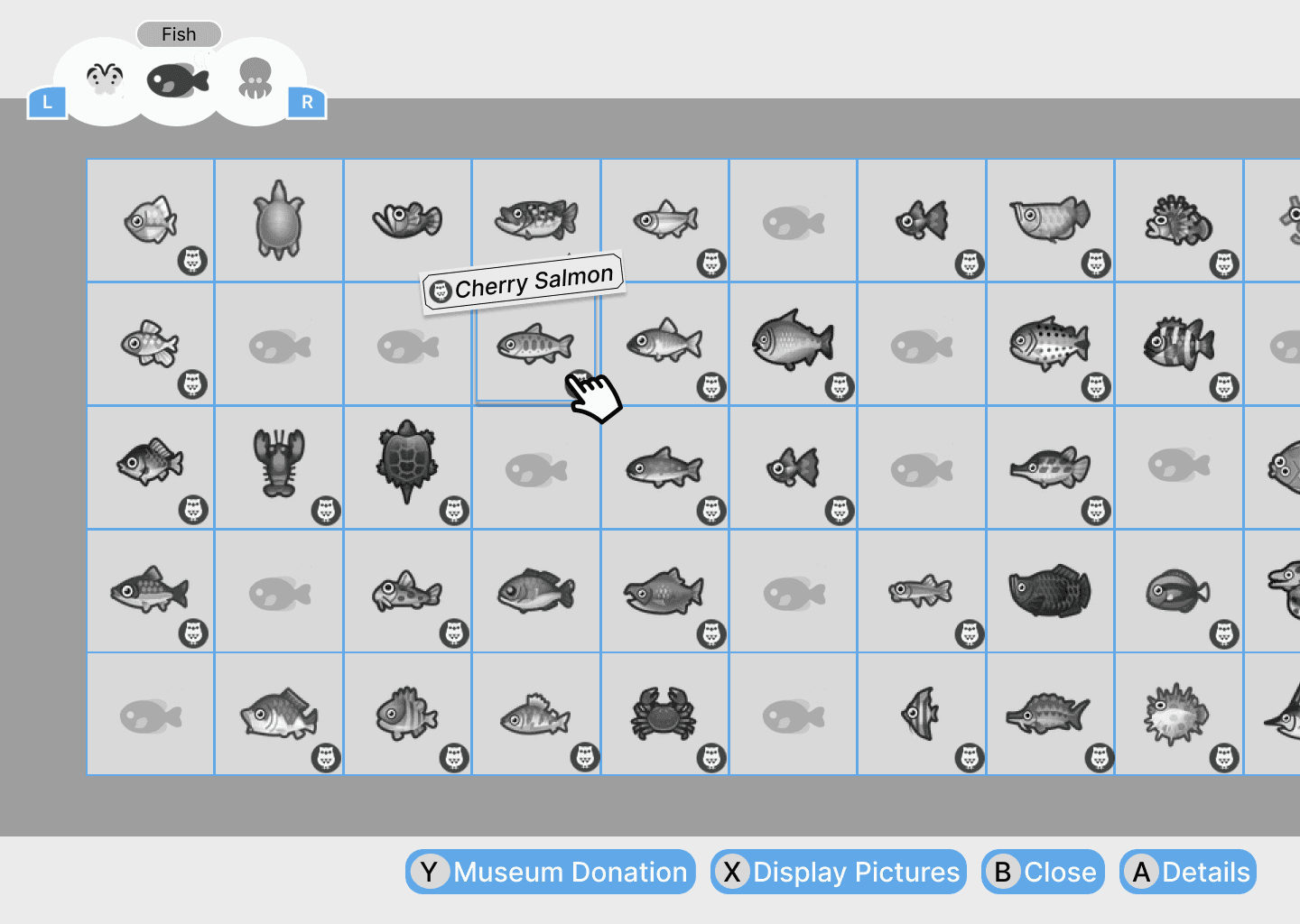
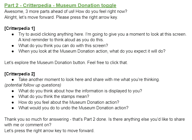
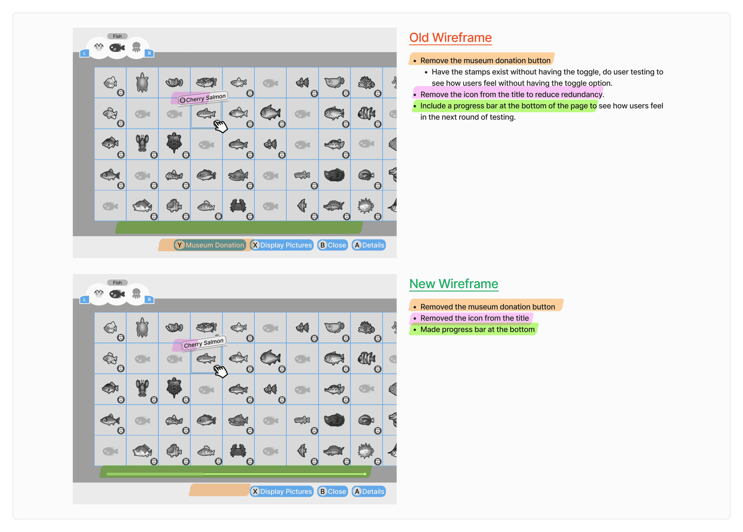
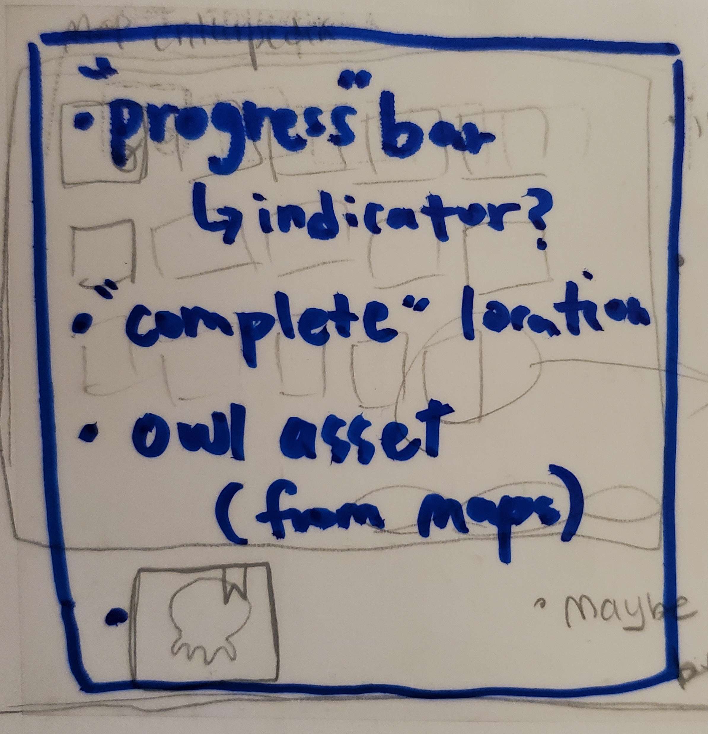
Critterpedia: Improve signifier for a critter’s donation status to the museum
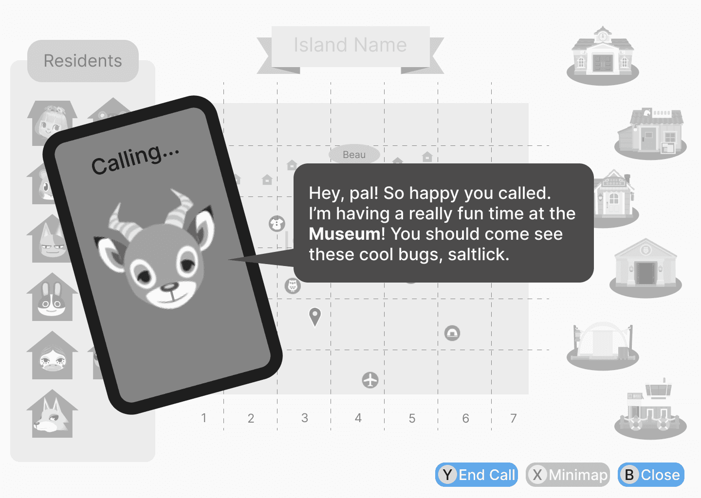
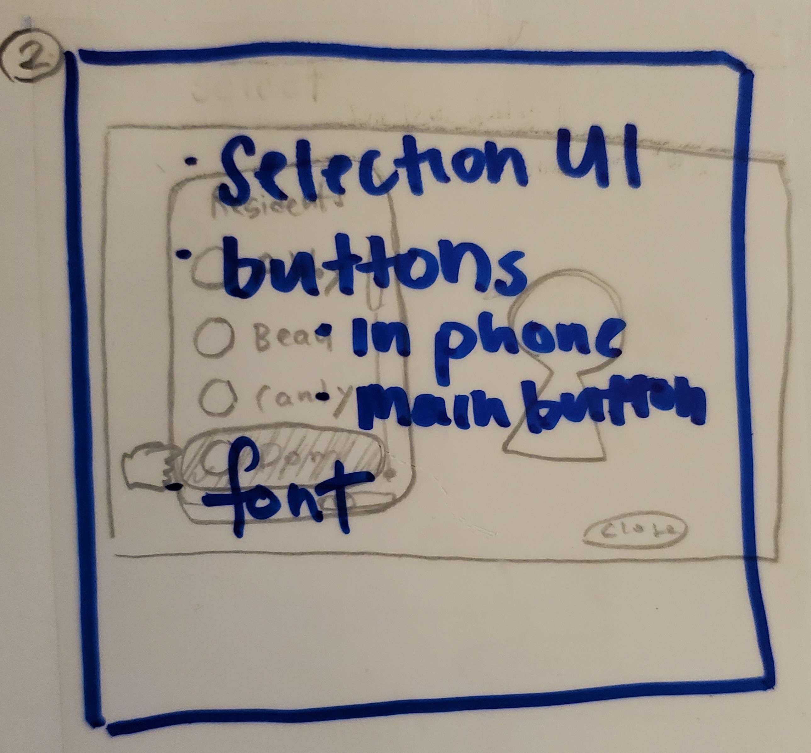
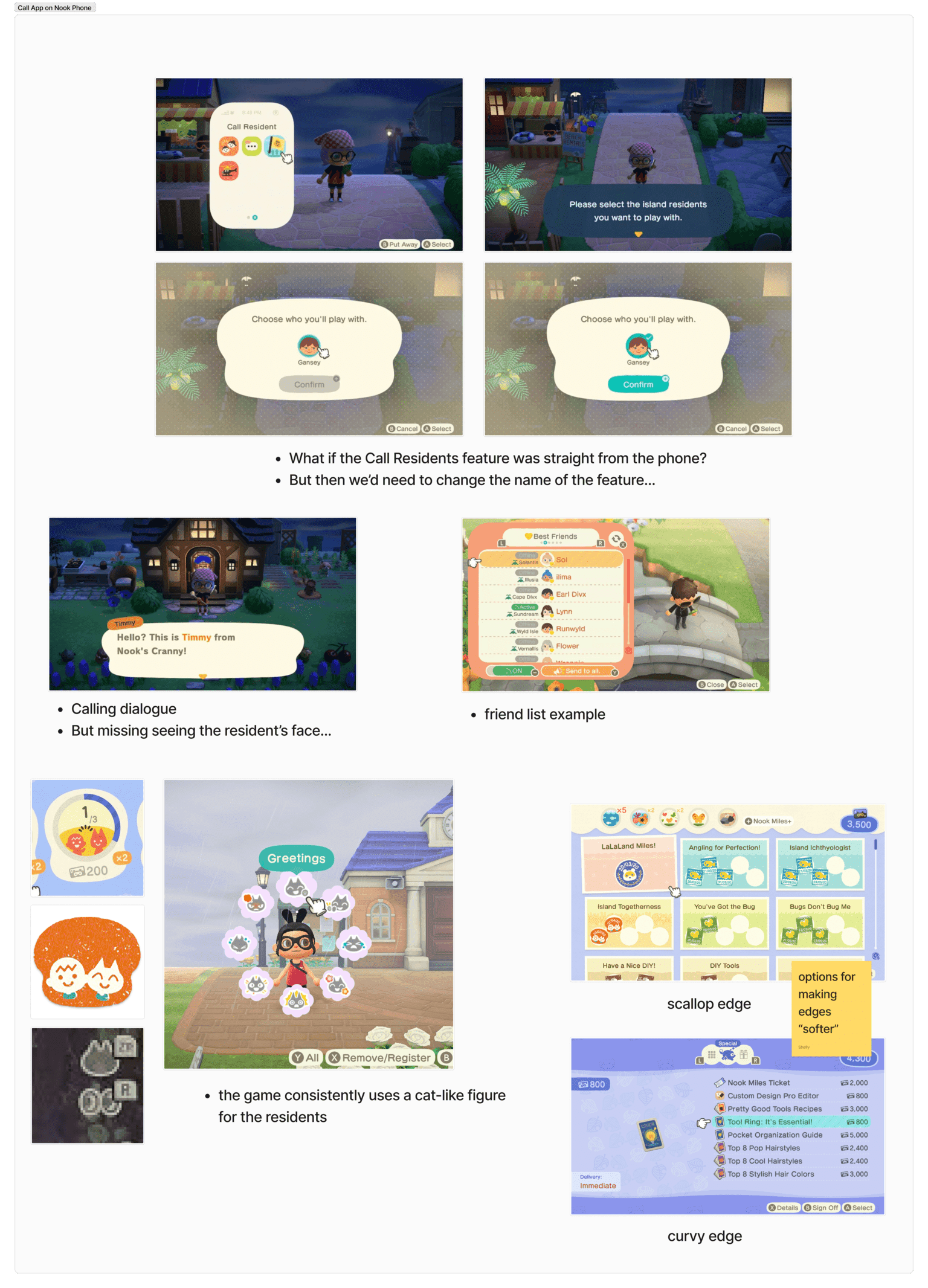
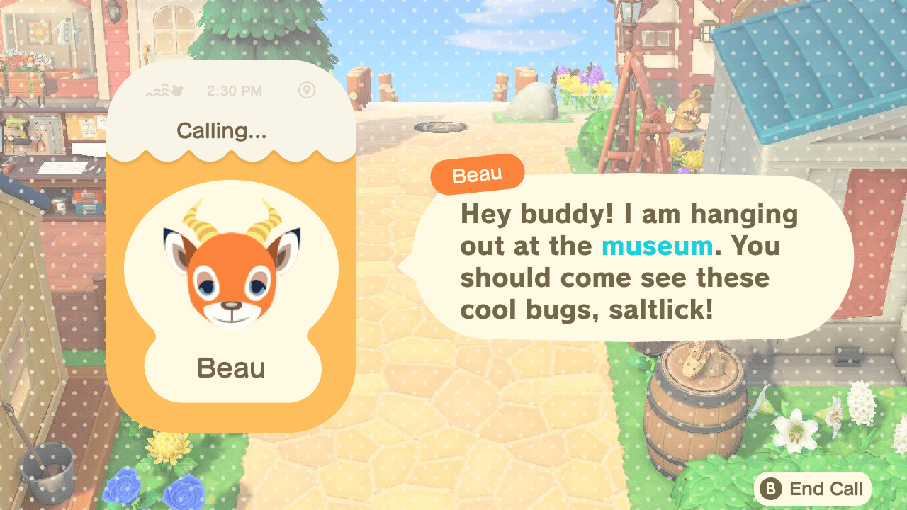
Call a Resident: Design a feature that helps the player find a resident


Usability Testing
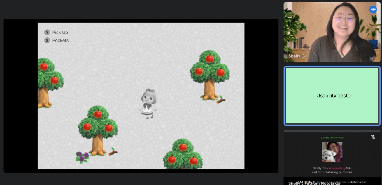
I was really looking forward to this part! I started off with a test plan and recruited 5 testers between ages of 24-37 (1 male, 3 females, 1 non-binary) through my personal connections. All players have had experience with playing ACNH, so they had familiarity with the Critterpedia and Maps screens.
My research goals were to:
Gauge how players feel and think about the new features added
See if players understand the new features and actions
Understand how users feel about how the information is displayed on all screens
Evaluate how players will interpret the new designs
Receive general feedback for potential design iteration
I then wrote tasks and questions for the above goals and organized everything in my user testing script. After conducting a practice test with a fellow classmate, I made minimal adjustments and we were ready to roll.
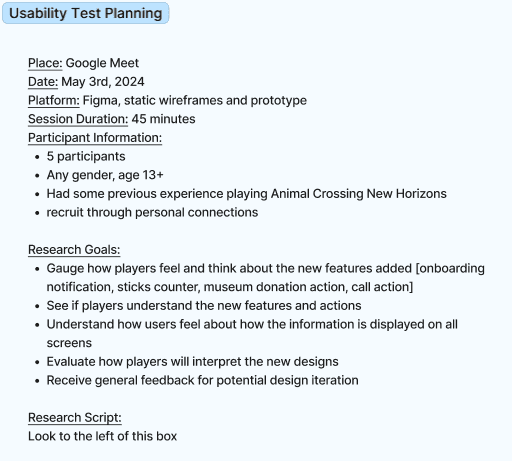


I moderated and conducted the tests using Google Meets and Fathom and completed under 45 minutes. All five tests were scheduled for and conducted on the same day.

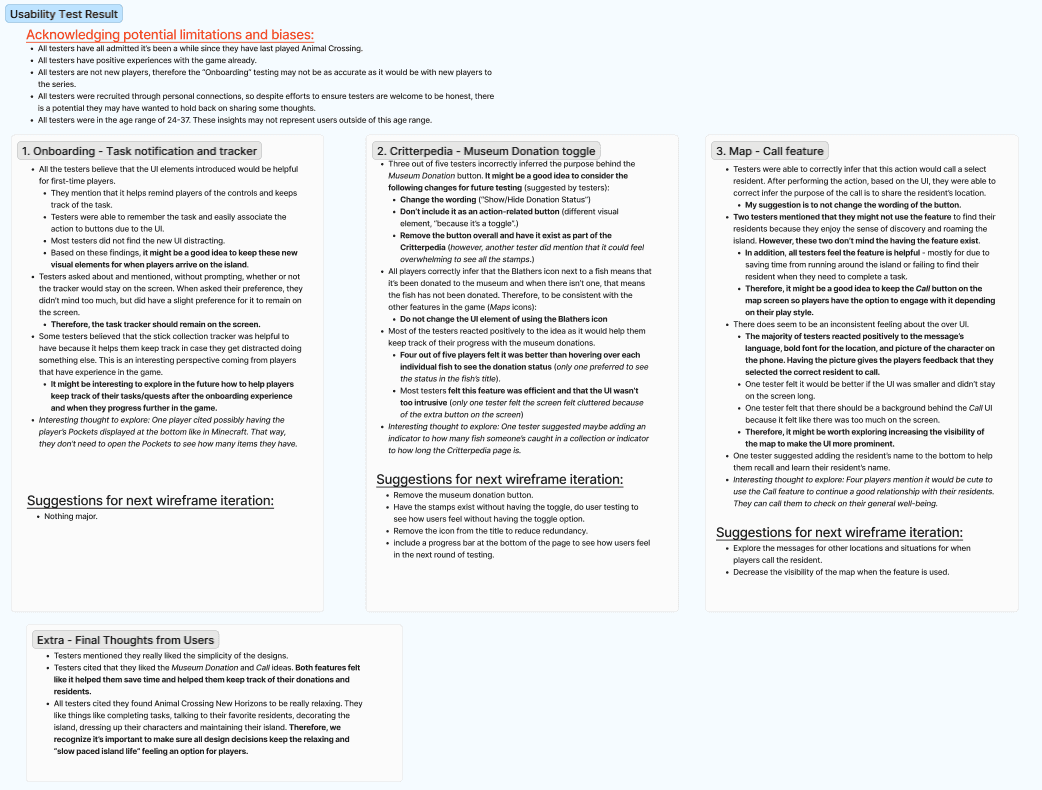
Test Results & Actionable Insights
The tests went really well! I organized the notes. It was really cool to see ideas the testers suggested, learn about their thought process behind decisions, and gauge their feelings about the designs. Overall, there were positive feelings towards the new ideas, but definitely needed some tweaking in the next iteration. From these results, I also found there were more questions that could potentially be brought up in future testing. See the results and testing limitations on Figma
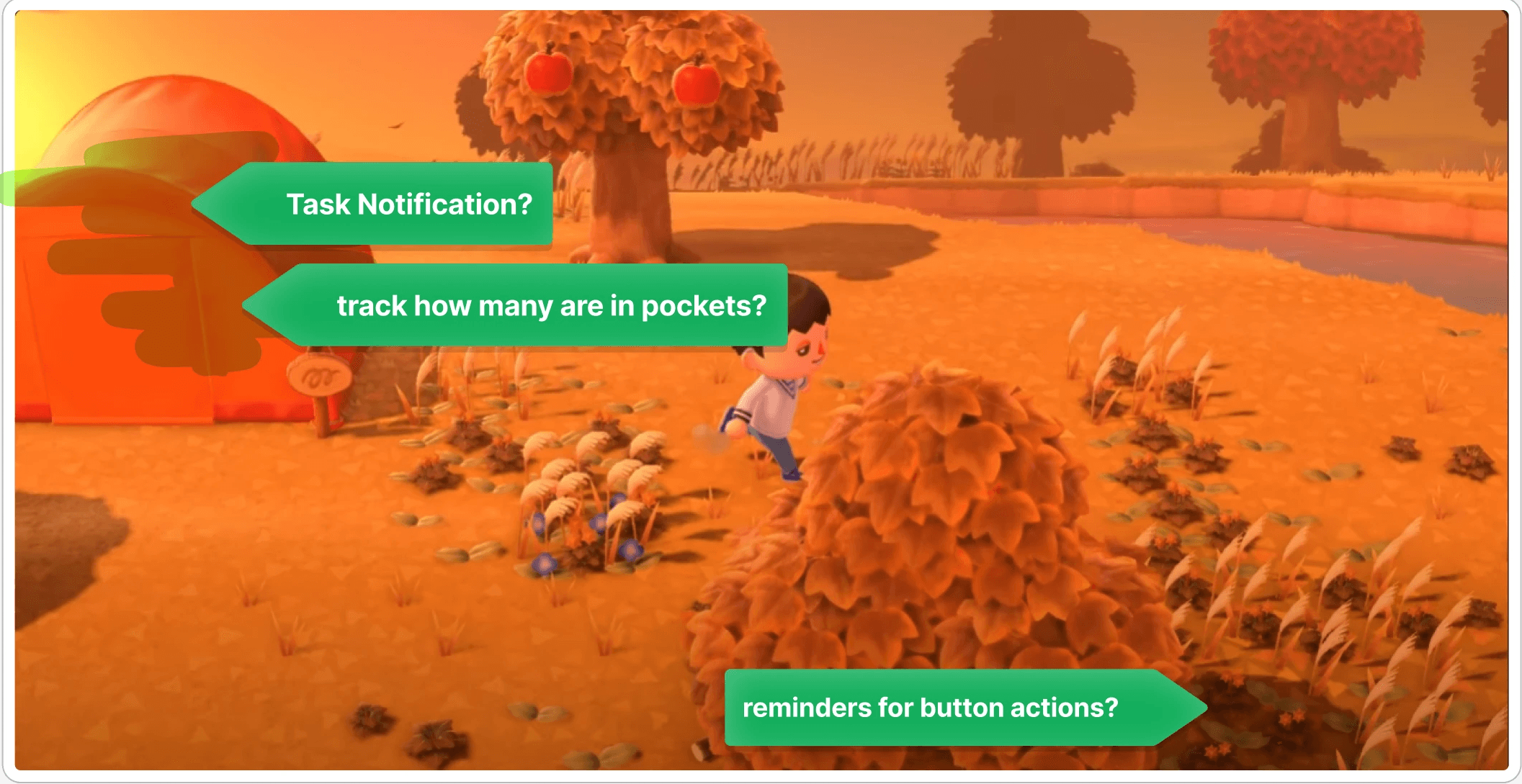
Onboarding - Notification & Task Tracker

Onboarding - Notification & Task Tracker
Onboarding - Notification & Task Tracker


UI Design
Making a Mood Board
I had no experience creating UI assets and style guides before, so I decided to make a mood board to get a better understanding of ACNH’s current aesthetic and style rules. I went back to my wireframes and used transparent sticky notes to jot down specific UI assets I needed to pay attention to. After that, I looked for and compiled relevant screenshots.


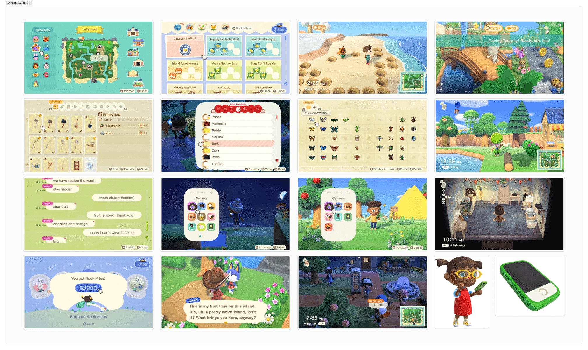
Images courtesy of Nintendo, www.gameuidatabase.com, and interfaceingame.com
Style Guides
Reassess and Organize
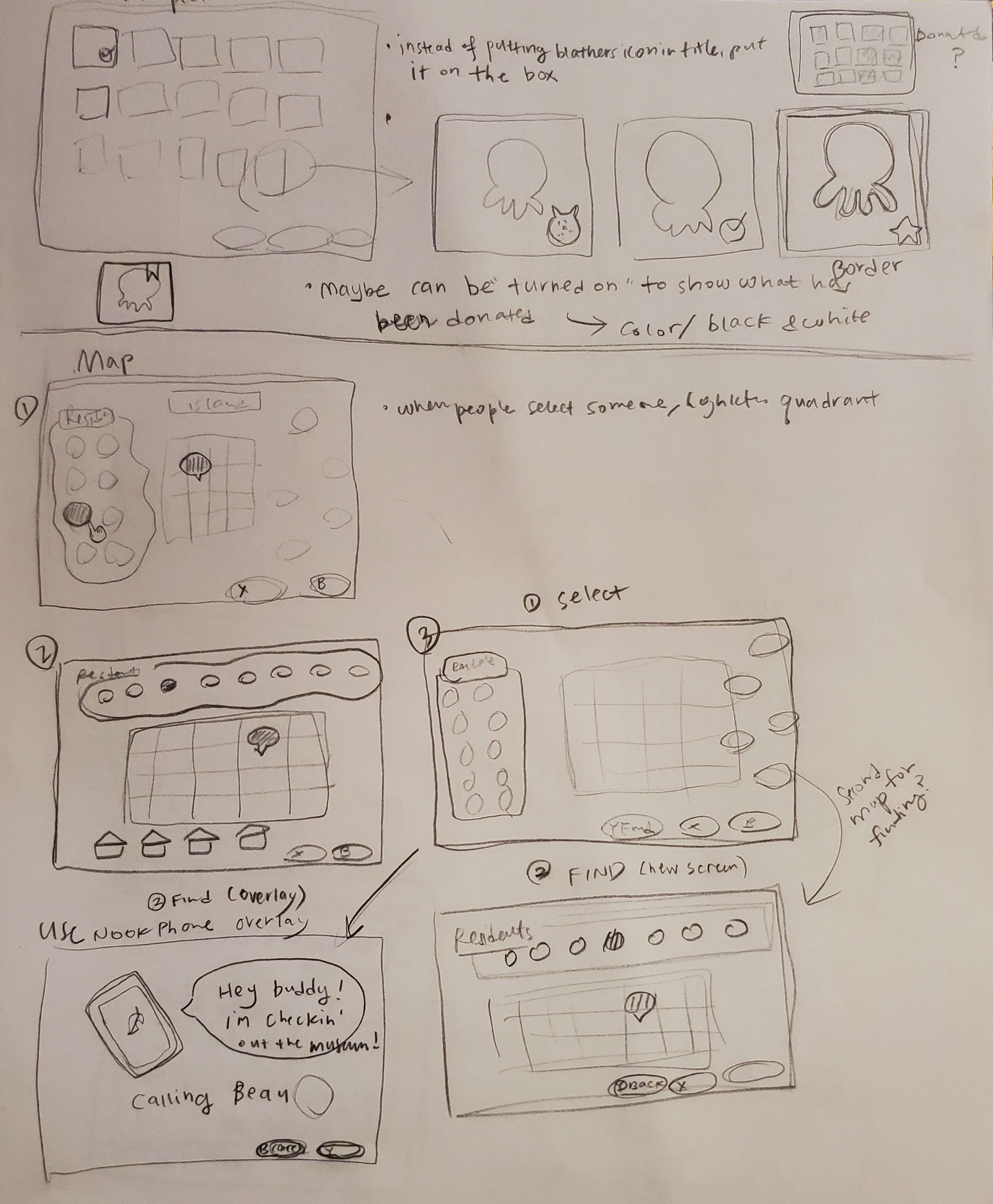
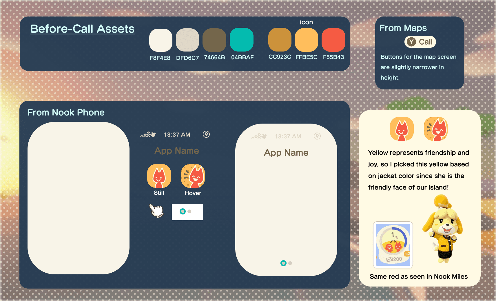
While ACNH may share some general style rules across some things, a lot of designs and features had their own rules and color palettes that weren’t consistent. In addition, I was creating things that did not exist (such as the Call app in the NookPhone), so this was a very big challenge for me. It was important that I reorganized my mood board based on the designs I was creating for and carved out some time to take notes. I also sketched out how the NookPhone app UI would look like.


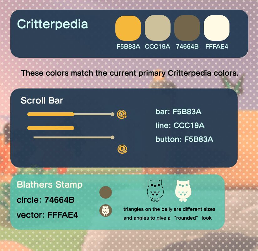
Final Style Guides
I created style guides for each screen. It was this single experience alone that took the most time and made me appreciate video game artists more than ever. There were so many little things to consider and recreate, and I learned so much in this process.


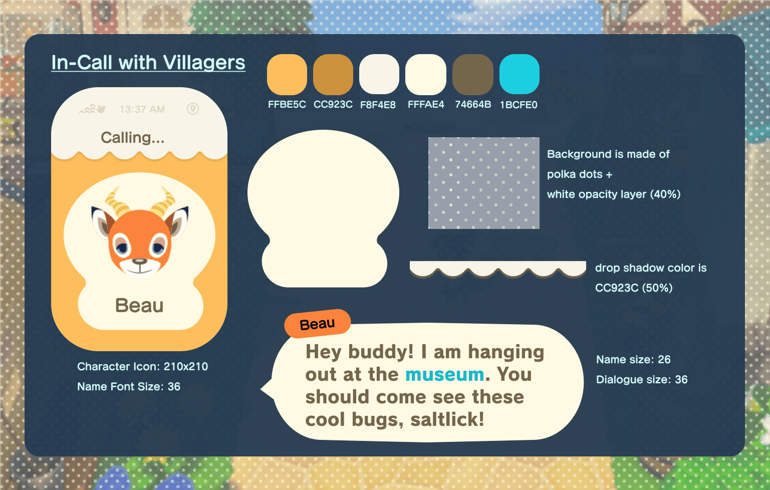
Color-Blind Testing
Creating the style guide really streamlined making the the hi-fi wireframes. After completion, they went through a colorblind test. Overall most of them passed, but I had some issues with some screens under the monochromacy/achromatopsia filter. Some tweaks in opacity and small color changes did the trick for me in this case.


Final Mock-ups
Onboarding

Critterpedia

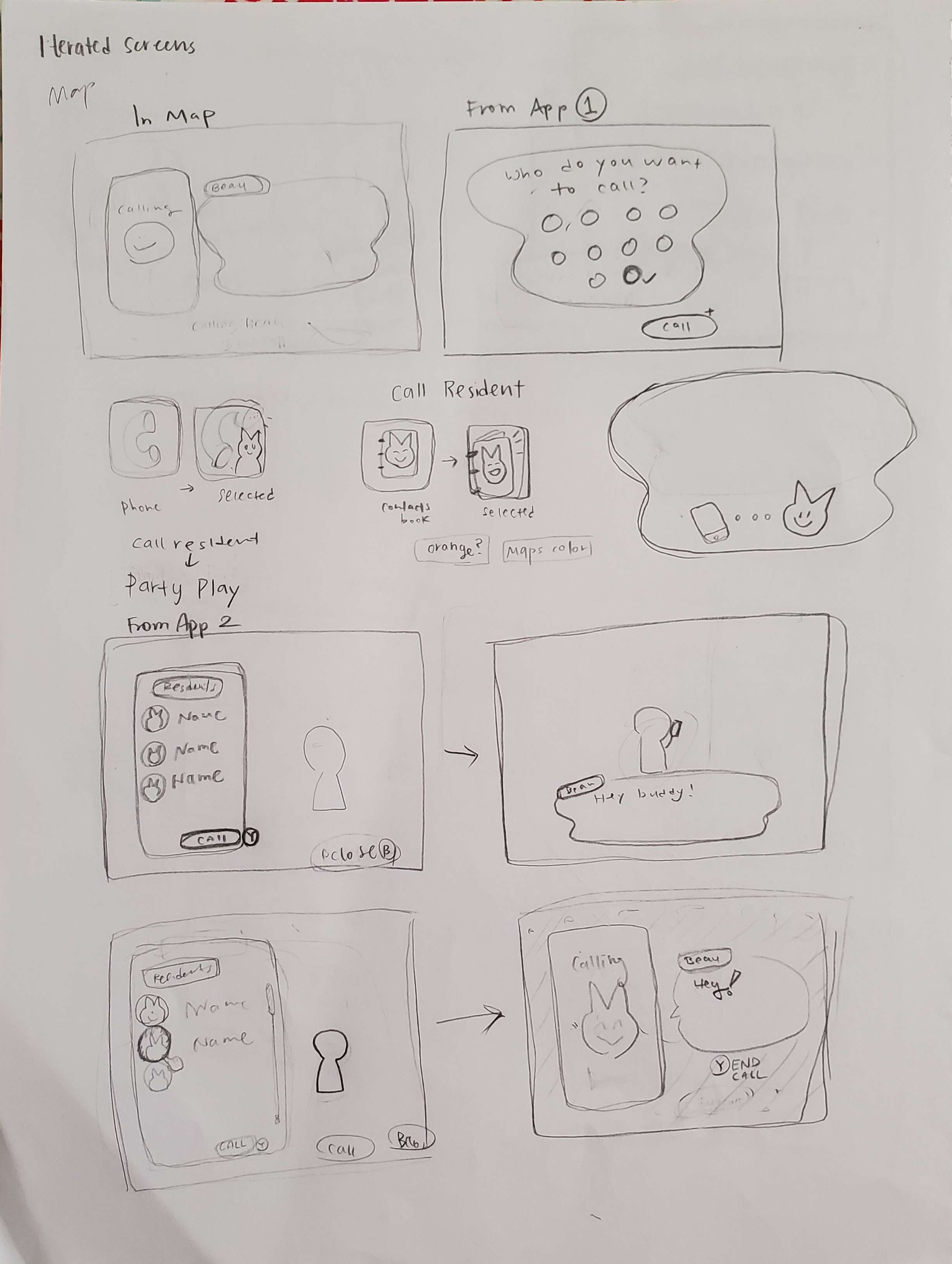
Call Resident from NookPhone

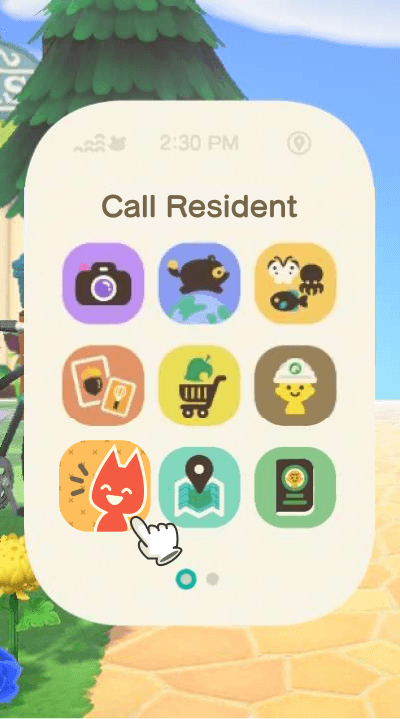
Call a Resident app still and hover state


Call Resident from Map


Final Thoughts
In regards to the project’s objects, I definitely accomplished everything I set out to do. I thoroughly enjoyed taking this course and doing this project! It was really fun applying UX practices in the context of video game development and learning about how many people you need to be in communication with throughout the whole process to create an enjoyable experience for our players.

Another thing I learned during this process was to roll with the punches. While making the moodboards, I realized that I completely forgot that there was an interface for the NookPhone (the player’s smartphone in the game).
It made me realize “What if it made more sense in the player’s conceptual model to call from their NookPhone and not from their Maps app?!” On the other hand, “What if players think ‘where?’ and go to the Maps to find their resident?”
I talked to two other people about this, and was resolved to create UI assets for both scenarios - a call feature from the Maps and a call feature from the NookPhone. Even though this meant I was going to do a lot more work creating a completely new set of screens, it was definitely worth it to explore another path players could take.
Upon reflection, my biggest challenge was UI design portion, but it was also a something I was most proud of. It was a rocky start, but I learned how important it was to have cohorts and colleagues. I asked for opinions and feedback, as well as advice on how to accomplish specific ideas for recreating the ACNH assets. This really solidified for me how important it was to create connections with those around you and ask for help when you need it (shoutout to my classmate, Junine!)
What's Next & Thank Yous!
If I had the opportunity, I would love to user test the new mock-ups to get feedback and iterate on them. I also discovered that there was an interesting discrepancy between a design that I casually A/B tested with the usability testers and classmates. This would also be something interesting to explore for the future.
While I initially did not think I was going to enter this industry, I want to continue learning more about how to building better experiences in the context of games. I am planning to read more literature on the subject.
Thank you to Ivy Sang (for providing fantastic course content), Jacob Lee (for the feedback on my assignemnts), and my classmates in the class Discord (for being so supportive)!