SHOPORG is a Los Angeles-based startup seeking to redefine online shopping through smart technology that supports a personalized experience. Before the full launch of their platform, they wanted to ensure their website design aligned with user expectations. Our team’s usability testing uncovered confusion with the platform’s features, as well as a lack of visibility for what users valued. We made recommendations across three webpages to improve the overall discoverability of SHOPORG's features and offerings.
Team:
Shelly Guan
Tracy Khiew
Archie Dhurba
My Roles:
UX Researcher
UX Consultant
Tools:
PrivatePanels
Figma
Zoom
Duration:
7 Weeks
Oct 2025- Dec 2025

During our first Zoom meeting in October, SHOPORG’s CEO approached us seeking an evaluation of their beta site. They were in active development and planned to fully launch their platform within the next five months. The request was simple, but complex. They wanted a general evaluation of their design to learn how users would navigate, understand, and complete typical shopping tasks with the platform. However, because of their agreement with investors, they were not allowed to share with us any sensitive information that would be privy to competitors before launch. This included the website’s current design as well as the company’s primary proprietary feature that made the product unique.
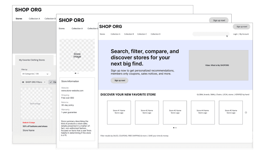
Excluding any details about their core technology, our client was gracious in answering our questions about the product’s general offerings. We were given stripped-down NDA-safe static wireframes, composed of squares and placeholder text, and void of color. As this was their platform’s first UX evaluation and because of the NDA, they also weren't too sure what could be evaluated and what outcomes they were looking for. While this was definitely going to be a challenge, we accepted it and were determined to use what we did have to help improve SHOPORG’s design. We assured our client that we would take a look at the prototype and send her some test questions and tasks to choose from to help them narrow down their evaluation goals.
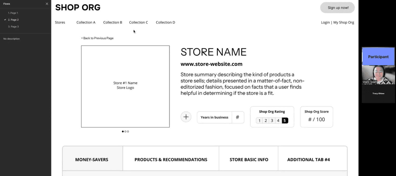
Our team looked through the wireframes and asked our client clarifying questions to understand how each page connected to the other. Because of the general placeholder text, we also needed to understand the underlying relationships and pathways across all the components and pages. We decided to do an explorative usability test, as the product has not yet been launched, and users can still be able to inform us of their expectations even with a low-fidelity prototype.

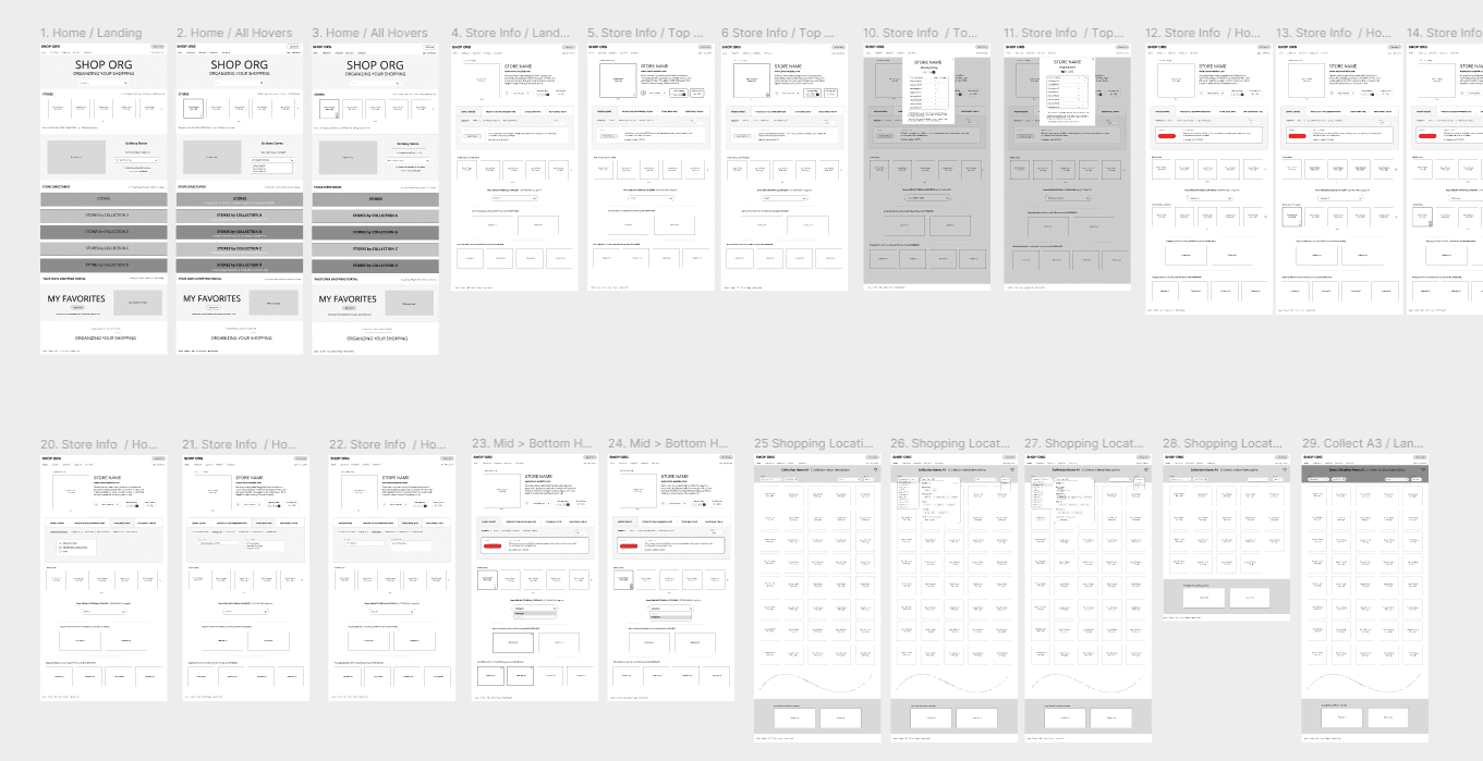
We determined, based on our client meeting, that these pages were a high priority for the client. Each of these three pages encapsulated various features that the client highlighted were important to SHOPORG’s platform. Together, our team generated a variety of questions ranging from gathering first impressions to user speculation of a page’s purpose to what color palette participants expect to see with this platform.
As we promised in our kick-off meeting, we sent our client a list of roughly 30 questions to peruse through. We asked them to select 5-7 top-priority questions they want most answered. However, we didn’t expect our client to highlight 24 tasks and then add a new one to the list (bringing the total number to 25). This was unexpected, but our team focused on what our client gave us and narrowed the list down to 10 tasks spread across the three webpages.


With limited prep time, we only focused on making the pages and components necessary for our test. We only made certain buttons, dropdown menus, and tabs interactive if they were relevant to the scope. Additionally, since our tasks were separated by evaluating each page individually, it was not necessary to connect them through navigation paths. Instead, we utilized Figma’s Prototype “Flows” to create Pages that participants can select during testing.
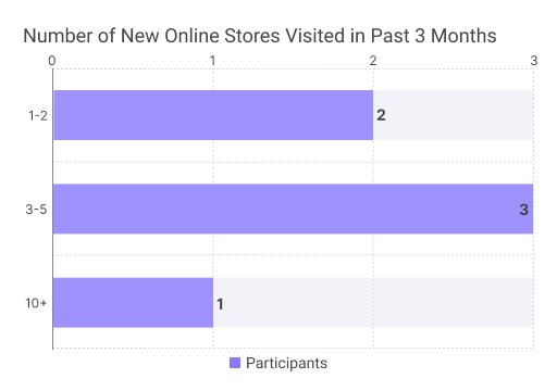
Recruitment was done using PrivatePanels and a list of interested participants from our client. Our client specified that the target users were women who were frequent online shoppers between the ages of 25-55. Our team also determined, based on the platform’s features, to find shoppers who have recently explored new stores and go out of their way to find the best purchase option.
We selected 6 participants who shopped online at least a few times a month, recently explored new stores, and were moderately confident in their ability to compare online stores to buy the best option.


After completing a pilot test and finalizing the script, we conducted moderated testing sessions over Zoom within one week. Participants first completed a pre-test questionnaire to provide insight into their online shopping behaviors. Then proceeded to complete the ten tasks across the three webpages, focused on evaluating their search behavior, first impressions, expectations, and comprehension of SHOPORG’s features.
After completing all six tests, our team compiled all the data for analysis on Figjam to find common themes and patterns. Not only did we discover recurring pain points within each page, but we also started to see a shared pattern of themes across all three pages.

📌 SHOPORG’s value proposition was unclear.
5 out of 6 participants stated it was unclear how SHOPORG would help them with their online shopping, despite correctly assuming the platform's features initially.
📌 Users struggled to differentiate between categories, collections, and favorites.
5 out of 6 participants struggled to distinguish between the different categorization options and could not discern how each feature would support their experience.
📌 Users don’t want to click; they want to see information immediately.
5 out of 6 participants wanted key details at a glance. Information, such as deals and product recommendations, should be immediately visible, without clicking or scrolling.
Most participants could not confidently say what the platform offers to support online shopping. The design relied on small text scattered throughout the page and an information section that resided at the bottom.
"How it's going to help me shop better is what I don't understand."
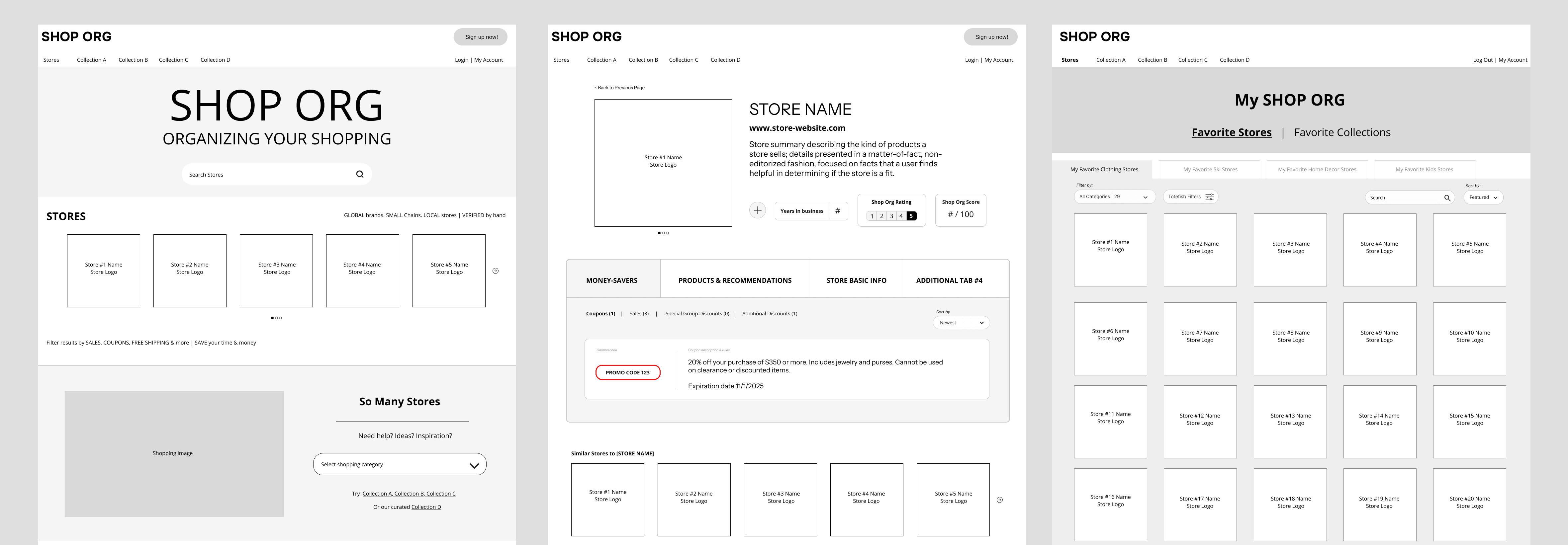
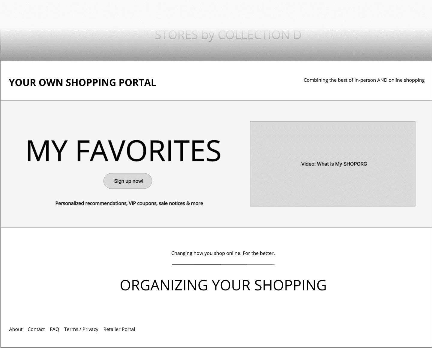
Using what already exists, we suggest moving the information section to the top of the homepage and adding a short and bold tagline so users can immediately discover how SHOPORG can support their online shopping.
Before

After

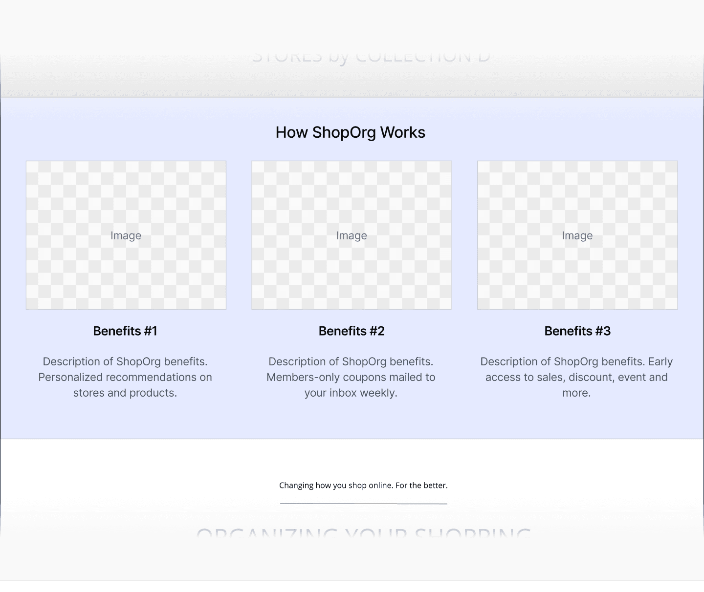
For users who want to learn more, this section provides a simple overview of the key features. Images, bold headers, and short descriptions will present the information clearly and easily digestible.
Before
After
Users can organically pick up what personalization features SHOPORG offers by taking what is already written in the small text descriptions and implementing it in the headers instead.
Before

After

We observed that participants were confused whether they could search for an item or if they had to have a store in mind.
"Am I searching for a very specific thing, or am I searching for a specific store?"
This simple change will communicate to users that they can search for both items and stores.
Before

After

Store Info Page
Most of our participants did not value store details at the top of the page, even though they understood its usefulness. They felt it took up too much real estate compared to the information they did find valuable (coupons, promotions, product recommendations) hidden in tabs.
"I’d like to see more of what [the stores] have to offer, rather than what they are."
Instead of hiding the store offerings, display them directly on the page so users can discover them without having the click through tabs. The store details are reorganized into a sidebar and a smaller area on top. This will give users the information they value without having to look for it.
Before

After

A key feature of this page is that users can add this store to their favorites or collections. However, all six of our participants failed to discover the feature. They were looking for a call to action.
"I don’t see anywhere where it’s asking you to save [the store]."
This way, users know where to look if they want to save the store to a specific collection or favorite stores list.
Before

After

Participants liked the clean use of boxes, but felt the interface was lacking valuable information. They preferred having special deals and promotions displayed on the interface, so they did not have to click through each store to find what they were looking for.
"It would be nice to see all the deals on this one page without having to click on all of [the stores] individually."
Putting deals and promotions relevant to the Favorite Stores tab category will allow users to easily browse and compare offers to find the best deals.
Before

After

Part of SHOPORG’s smart technology is its granular filtering system. Participants liked the filters, but participants found hiding the filters in a dropdown menu counterintuitive. The organization of the filters was unfamiliar to them and required reopening the dropdown to confirm which filters were applied.
"I would expect these filters to be more visible rather than hidden."
As this is a primary tool for this page, we suggest increasing the discoverability of the filters through the use of filter chips. This way, users can quickly select the filters they want to apply and see which ones are active on the interface.
Before

After

The SHOPORG team responded positively to our research and recommendations, stating the feedback and findings were helpful for moving forward in their product development. After answering the SHOPORG team's additional questions, the CEO said at the end, "Your proposals were incredibly action-oriented, which are very clear to us on what we need to do."
Since our presentation, the SHOPORG team has updated us that they will be implementing changes to their interface based on our recommendations before their official launch in early 2026. We're looking forward to seeing what's to come!

Our team presenting our research and findings to the SHOPORG team over Zoom
With great challenge comes great reward—This was my first time working on a project involving a NDA, which gave me the unique opportunity of working on a product without it's final design and main feature.
⭐ You can test anything
We tested a low-fidelity prototype with placeholder text and still walked with loads of of valuable data. This experience reinforced that you don't really need polished designs to learn a lot as long as you're observant and asking the right questions.
🎯 Focus on quality, not the number
We were initially concerned 10 tasks and 8 recommendations were too much. In the end, I learned what mattered more was how we conducted our tests and crafted each recommendation. Focusing on thoughtful, high quality work was more important than keeping the numbers small.
🔍 Look beyond the tasks, stay observant during and after testing
Our key insights came from noting subtle behaviors and seeing the bigger picture in the data. In addition to task outcomes, I learned its equally important to pay attention to small behaviors and reactions that may uncover underlying patterns across all participants.

Team AIM!