Amtrak serves passengers across 500+ U.S. destinations, but our user interviews revealed that riders struggle to find trip-planning information. Navigation labels felt ambiguous, information and action-oriented content competed for the same space, and support options were harder to find than expected.
We conducted generative and evaluative research methods (user interviews, card sorting, tree testing, comparative analysis, and usability testing) to understand where the experience broke down and why. Our findings informed three core redesign decisions: restructuring the navigation to match how riders think about trip information, separating the booking widgets from informational content, and redesigning the customer support landing page into a consolidated help hub.
Team:
Shelly Guan
Kathleen Cajamarca
James Huang
Betty Yang
My Roles:
UX Researcher
UX Designer
Tools:
UXMetrics
Figma
Zoom
Duration:
7 Weeks
Feb 2025- May 2025
Through initial exploration of the website, we noticed that information critical to trip planning was buried or hard to find, such as figuring out how to get a student discount. We set out to understand why and what a better experience could look like for riders seeking information to plan, prepare for, and make the most of their journey.
To answer this question, our research goals were to:
01
Understand current navigation behavior
Identify where and why riders lose their way when looking for trip planning information.
02
Identify what information riders prioritize
Understand what matters to riders before, during, and after booking their journey
03
Uncover how riders expect inofmration to be organized
Learn how riders expect information to be organized so structural changes will be aligned

Talking with riders to find where the experience breaks down
We interviewed eight Amtrak riders to understand their end-to-end experience with the website, focusing on how they searched for and made sense of trip planning information.
Each team member individually transcribed observations and quotes onto sticky notes in FigJam to synthesize our findings. We grouped common themes to uncover patterns across our participants, a process known as affinity mapping (Figure 1).

📌 Locating specific details was frustrating
Details such as station amenities, baggage rules, cancellation and refund policies, and customer service were challenging to find.
“A few days before my trip, the baggage information was not immediately visible. How much I can pack and also what I can pack?”
⚠️ Impact on Business: Many of our participants were able to recall these frustrations because that they often needed to find this information at the last minute or when they were in a rush. If riders cannot find important information they need in those vital moments, it may impact their overall experience before or during their Amtrak trip.
Since the interviews revealed that riders struggled to locate information, we wanted to understand how they would naturally organize the content themselves. We first conducted a content inventory, then ran 8 moderated tests using UXMetrics with a think-aloud protocol (Figure 2).

Figure 2: Moderating a card sorting session to understand how users organized planning information
After all sessions were complete, we analyzed the results using a similarity matrix (Figure 3), which shows how often participants agreed on placing the same content in the same category. A higher percentage of agreement indicated a stronger shared way of thinking among participants.

Figure 3: Similarity Matrix analysis of card sorting groupings after testing
📌 Travellers organized information sequentially, following their journey from booking to arrival.
The majority of our participants grouped content by where they expected to be in their journey: before booking a ticket, before boarding, or on board.
📌 Standalone topics like accessibility and support were treated as separate from the journey flow
Participants saw information about stations, accessibility, and customer support as needs that are not dedicated to a specific phase of travel and should be easy to find in any moment of the trip.
Drawing on insights from card sorting, we proposed a new navigation that organized content around the phases of a traveler’s journey under the “Plan A Trip” category.
To validate this structure, we ran 8 moderated tests on UXMetrics, and all of our tasks were based on scenarios our interview participants mentioned, covering both common and edge case situations such as understanding baggage restrictions, modifying a trip, and finding out what to do when an item is lost.
Participants were asked to think aloud so that we not only observed success rates but also the reasoning behind their choices. Afterwards, our team analyzed the path flow of our participants to see how they collectively navigated through the navigation to find what they're looking for (Figure 4). This showed us where users got stuck and the final category they believe the information should live in.

📌 The redesigned hierarchy was overall easy to navigate
Most users found what they needed with high success rates, typically in under a minute. This was a strong signal that the new structure aligned with users' mental models.
📌 Content for special circumstances needs to be reachable through multiple paths.
For edge cases like finding the bike policy or reporting a lost item, participants took notably different routes. Some go through the main navigation bar, some through booking management, and others directly to customer support. This pointed to a need for cross-linking rather than a single fixed path.
📌 Widgets were misinterpreted as content categories.
Amtrak's existing navigation embeds functional widgets (Book, Train Status, My Trip), but many participants expected these to lead to informational content. This labelling ambiguity was a clear flag for the redesign.
During interviews, several participants mentioned that they benchmark their Amtrak experience against other travel websites. This gave us a clear prompt to look outward. We selected six long-distance travel platforms across trains, buses, and airlines: Brightline, Alaska Railroad, Greyhound Buses, Via Rail Canada, Delta Airlines, and Southwest Airlines.
As seen in Figure 5, we analyzed across five dimensions: the booking experience, ticketing information, route discovery, travel policies, and support for when something goes wrong. This helped us identify navigation and content patterns to consider and informed the structural decisions we made heading into the redesign.

Figure 5: Comparative Analysis across travel platforms (trains, buses, and airlines) - See the Comparative Analysis
📌 Organizing the navigation dropdown around trip phases and using a strong visual hierarchy made information easier to find.
Many of the highly rated platforms organized their navigation bar around phases of the trip experience and used strong text hierarchy and visual groupings. This reinforced what we found in card sorting, where participants naturally organized content by phases of their journey, and gave us a visual reference for how to bring that structure to life in the redesign.
📌 Action-oriented features like booking, managing a trip, and getting help were separated from informational navigation.
Rather than embedding these functions within the main navigation bar as Amtrak has it currently, many platforms position them as distinct, standalone widgets on the homepage or in the top right corner of the navigation.
Each team member individually sketched as many ideas as possible for the navigation bar, mega menu, and key micro-interactions (Figure 6). This allowed us to explore what our research insights could look like in practice before coming together as a team to discuss and align on a design direction that could address the issues riders raised during our initial research.

Before moving to prototype testing with users, we held an internal gallery walk to pressure-test our design directions with fellow designers. We walked participants through our research findings and the decisions they informed, inviting honest critique on whether the designs felt intuitive and well-reasoned (Figure 7).

📌 Reduce the cognitive load in the mega menu.
Reviewers felt the layout presented too much content at once, making it visually overwhelming. We removed the embedded search widget and reorganized the layout to make the text easier to read.
📌 Revisit labeling in the navigation bar and booking widget for clarity.
Many suggested alternative labels that felt more intuitive and task-oriented, so "Find Trip" was relabeled to "Manage Trip" and "People" to "Travelers" in the booking widget.
📌 Reintroduce "Manage Trip" back into the navigation bar
Many reviewers felt this was a critical feature that had become too hidden in the proposed design. So it was reintroduced back into the main navigation bar next to the new book button.
With our designs refined, we moved to usability testing to validate whether the structural and labelling changes we made from the design critique actually translated into a better experience for real users (Figure 8). In our previous research, we observed our participants not only utilizing the navigation bar to find the content, but also wanting to access their booking to find information specifically pertinent to their actual planned trip. For example, if they wanted to learn about baggage allowance, some participants would go to the navigation or they would enter trip information to pull up their booking. So, we came up with scenarios that captured both of these scenarios
Five participants were recruited to interact with paper prototypes of the redesigned navigation, and to test completing two tasks:
🧳 Task 1: Finding Trip Planning Information
Find baggage policy for carry-on luggage
Testing: Navigation Bar, Mega Menu, Information Content Page Layout
📅 Task 2: Modifying An Existing Trip
Changing an existing booking’s date and time
Testing: Navigation Bar, Booking Widget, Manage Trip widget, Manage Trip Flow

Paper prototyping allowed us to observe how users interacted with the interface without the risk of visual polish masking usability issues. Post-its were used as drop-downs, folding the paper simulated accordion interactions, and transparent post-its gave participants spaces to "type in" their information (Figure 9). The lo-fi prototype kept participants focused on whether the experience and flow made sense, not on how it looked.

📌 "Plan" in the navigation bar is associated with the act of planning, not all trip information.
Many participants mentioned they had hoped to see a category for general information. "Plan" is associated with the "Before" process of the trip, but does not encompass all phases of the trip journey.
📌 "Manage Trip" was confusing because there were two options in the same spot.
With the new booking widget close to the navigation bar, users were confused by the two "Manage Trip" options in the top-right corner. Having two options nearby each other caused users to hesitate and try to figure out if they were different.
📌 "Need Help?" continues to be a relied on resource.
This further validates our findings in card sorting and tree testing, where users will go to customer support if they do not want to dig too deep into the site. Currently, the Amtrak help page does not align with what users expect because the landing page is empty.
" I would expect either an FAQ or a personal assistant in "Need Help." Sometimes when it’s difficult for me to look through, AI has become so dominant that I would just chat with it and see where it is on the website."
In usability testing, participants interpreted "Plan" as referring only to pre-trip information. Many expected a label closer to "General Information" that covered the full journey. Our comparative analysis reinforced this, showing that travel platforms use broader labels to cover information for every phase of the journey. Renaming it "Trip Info" lets users know that the content isn't limited to planning.
The menu organization also needed to reflect the expectation. Card sorting, tree testing, and comparative analysis all showed us that riders think about trip information in phases. We reorganized the mega menu into three phases of travel: "Plan Your Trip," "Before You Go," and "Onboard the Train." Station information and accessibility services are separated because participants in tree testing stated these topics should be findable at any phase of the journey. Card sorting and user interviews also revealed which content riders prioritized, so information that was previously buried deep in the hierarchy is surfaced to the top level, so users do not have to dig for it. Altogether, this structure makes the information easier to find because it is relevant to wherever travelers are in their trip.

Before: "Plan" organizes content by topic and buried info riders prioritized deep in the content hierarchy

After: "Trip Info" structures content by journey phase and surfaces the info riders care about
Tree testing revealed that embedding functional widgets alongside informational content caused participants to misread them as content categories. Comparative analysis showed that leading travel platforms consistently kept action-oriented features like booking and trip management separate from informational navigation. Together, these findings made the case for splitting the navigation into two distinct sides: information content on the left side and action-oriented features on the right side.

Before: No clear distinction between info and action so riders had to guess what each label led to

After: A clear left-right split so riders can see info is on the left and trip-related actions are on the right
Across every research phase, participants consistently mentioned that if they ever felt stuck, they turned to customer support. User interviews revealed that participants struggled to find the customer support number, and usability testing showed riders going directly to "Need Help?" for information like baggage policy or booking help when they couldn't find it anywhere else. Card sorting and tree testing reinforced this as it showed participants expecting content, like restricted items and lost and found item policies, to belong in a separate category for help and support.
We asked usability test participants what they expected to find after clicking "Need Help," and most mentioned a chatbot and an FAQ section. The current design offers a dropdown, and the only way to access more information is through a "Contact Us Now" hyperlink that blends in with the rest of the body text. When clicked, it leads to an empty landing page with a short sidebar. The redesigned landing page consolidates all help and support options into a single view, so riders can see everything available to them at a glance.
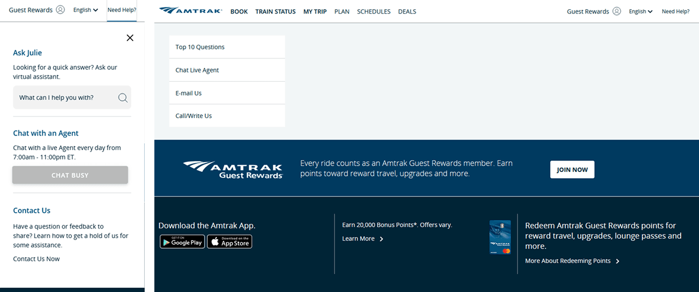
Before: "Need Help?" triggered a dropdown with three options (left), and clicking the unassuming "Contact Us Now" would lead to a seemingly empty landing page (right).

After: "Need Help?" now leads to a full landing page where riders can immediately see all support options, including the Amtrak chatbot and FAQ.
Redesigning the navigation did present a new challenge. The current booking widget is embedded within the navigation bar, so what would the separation between informational content and action-oriented features actually mean for the homepage? We carried the same logic from the navigation bar redesign to giving the booking widget its own dedicated space.
Comparative analysis showed that most leading travel platforms treat the booking widget as a standalone, prominent element rather than embedding it in the navigation bar. Usability testing also showed us that we can't simply place the widget directly beneath it either, because the participants were confused by the widget's tabs echoing the same action-oriented features in the navigation bar. Going back to our comparative analysis, it revealed a pattern: a header image between the navigation and the widget, creating the visual and structural separation needed to distinguish the two. The redesigned widget reflects what riders already expect from other travel platforms, while also giving Amtrak a natural opportunity to surface deals and services riders can take advantage.

Before: The booking widget was embedded into the navigation bar, in close proximity to the information categories

After: The booking widget now stands on its own, separated by a header image of Amtrak's deals and services.
We delivered a mid-fidelity prototype, accompanied with both high-level and low level design annotations to explain our design decisions. The mid-fidelity prototype supported 3 tasks: finding baggage information, rescheduling a trip's date and time, and accessing the FAQ content.
Our team also shared our findings and recommendations with our class in a 10-minute presentation. This allowed us to follow up on those who spoke with us during the design critique and open the floor to any additional feedback to consider. Overall, we received positive feedback from our peers, with one person sharing with us, "I really, really like the new navigation design. It’s really intuitive and so much more helpful."
Create a high-fidelity prototype following Amtrak's design system
Additional usability testing against other user flows (i.e. booking a ticket, signing into an account)
Explore the mobile experience as Amtrak riders are most likely on the go or will need to access trip information during their journey on their mobile devices.